


FYLD AI
Fixing Login
Who are FYLD AI?
-
FYLD AI is an international safety and work execution scale-up for the utilities and construction sector.
-
The users are quite often older men 40+ years old who work with their hands, usually outside.
-
The platform revolves around a mobile app for fieldworkers and a desktop web app for managers.
-
Hero feature: AI-powered risk assessment that uses NLP and computer vision.
My role
-
Design lead
-
Project management
-
User research
-
Squad facilitation
-
UX/UI design
-
QA
-
Analytics monitoring
The Project
-
Many users of all kinds reporting various problems with logging in.
-
Stakeholders with conflicting opinions about the causes and desired solutions.
-
Successful login attempts stand at 25-30% 🤦♂️ please get it up to at least 50%!
Discovery
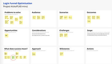
I held a stakeholder workshop to gather perspectives and align goals, after which I went into detective mode to understand the breadth of the issue, and followed up with...
-
Data analysis in MixPanel
-
User interviews (CSAT)
-
Customer success manager interviews
-
Session replay analysis on Smartlook
-
Slack channels (AI aggregations)
-
Tagging along to an implementation session in the field


Findings
-
Being logged out so frequently, sometimes everyday, was many peoples' biggest bugbear.
-
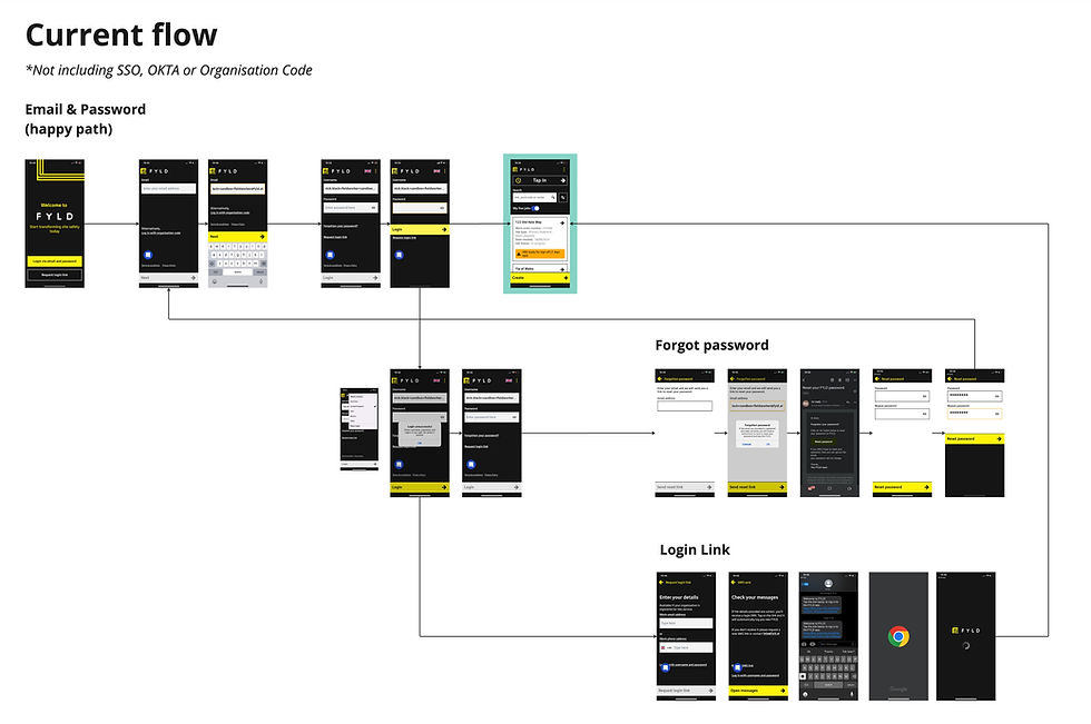
Too many methods of login: We had email & password, login link, OKTA, SSO, Organisation code. First time users especially had no idea where they were meant to go.
-
A whole host of usability issues, overwhelmingly on app.
-
A lot of "magic links" sent out were actually broken, or blocked.
-
The first time experience would redirect new users to nowhere.
.jpg)
Team Workshops
With so many diverse problems both technical and experience based, I decided the right approach would be to...
-
Work with the squad to explore how many problems were solvable through debugging and shared-brain techniques, over the course of 2 weeks.
-
Benchmark against other apps for opportunities to improve and use best practice
-
Design a whole new flow that would replace the old, crusty one.
Workshop 1: Why are users being logged out?
I spent a while setting this workshop up, but really the magic happened between the backend engineer and the ops representative, who went to town on user logs to find that a specific token was expiring well before it's due date.
I thought this was a great example of getting clever people in a room and discussing in good faith (without blame) to uncover where the issue lay.


Workshop 2: The Loop Of Hell
First time users were reporting not being able to log in, even with the right email and password... but why??
We experimented across devices and operating systems and eventually realised they were being redirected from the app to the web login page.
This was an infuriatingly easy fix 😂
Workshop 3: Login Links Expired
More experimentation, more debugging... Turns out the login links were getting confused by timezone differences.
A further login links issue was uncovered in the process - login links look 'dodgy' to devices, especially when coming from overseas, so our users in South America were really suffering.


Workshop 4: UX Audit
I asked the squad members to uninstall, then reinstall the app and go through the login process. They noted down any points of friction, there were a lot!
This added to my batch of login pain points from the implementation tag-along, and gave me great ammo for advocating a wholesale redesign of the flow.

Ideation
With technical issues partially solved, and usability issues in hand, I benchmarked some other apps, especially those aimed at older users.

Competitive Analysis
-
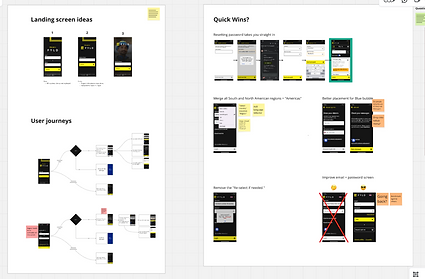
For apps with multiple login methods, a single input to begin was a nice way to simplify the experience.
-
I found that one-time-passwords tended to land well, especially those that work with 1 tap.
-
Onboarding screens are an effective way to introduce users to the new app with some nice illustrations.
-
As always, don't make them think, and AAA accessibility is a must for our older workforce!
Team Ideation
I worked with the squad to brainstorm the best way to reimagine the flow. We had many ideas, but eventually arrived at the conclusion that we should advocate strongly for using one time password, and sunsetting login links once and for all.
The new login flow
-
I advocated for one-time-password: We must direct all users toward this.
-
The device should remember the user's sign in credentials, and they should be able to login with 1 tap.
-
1 input to take users where they need to go.
-
Users should still be able to login with password or SSO/OKTA.
-
Remove the defunct 'reset login' and 'organisation code' - the last customer to use this had migrated to SSO.
🎨 Redesign
Here is the prototype we tested with 5 users. They loved it! The only actionable was to default to "SMS", not email, as that was 5/5 users' preference.
I also used the mandate to improve the first-time user experience to...
-
Include a brief onboarding section.
-
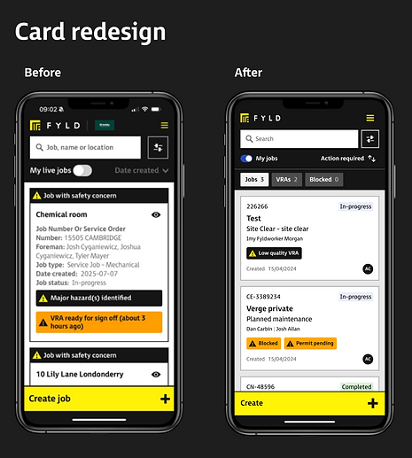
Redesign the job cards on the app landing page.
Handover & Implementation
-
High-fidelity designs in Figma, individual components specced out in detail, Spanish & English versions.
-
Both app and desktop delivered in 1 4-week sprint.
-
No V1 or V2 as we were essentially replacing the entire login experience - just a full redesign.


Outcome
Successful log in
57%

82%
We rolled out the new OTP flow in a staged way, one customer at a time. Customer success managers were instrumental in communicating this via champions.
We rolled the new flow out across all users and recorded an increase from 25% to 82% conversion between [login attempt] and [successful login].
4 weeks after release, customer success reps and ops channels had fallen silent - no more login issues 👍